Website Design
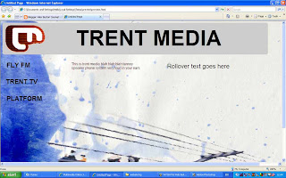
As part of my identity for Trent Media i am creating a website. I want the website to reflect and reinforce my identity that will exist in all manifestations of my project. I created the background for this website using watercolour paint and a scanner, although not visible in this image the thick paper i used to paint on gives the whole background a nice texture.
 I created the background for this website using watercolour paint and a scanner, although not visible in this image the thick paper i used to paint on gives the whole background a nice texture.
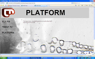
In this website I used the same painted background but with a different colour. I also tried to incorporate some of my design for the platform logo along the bottom (previous blog, Wednesday, January 17) I am trying to achieve web pages that are similar in style and tone but that are also individual to each strand of Trent Media.
I am slightly concerned about the loading time of a website with such a large picture as the background, although i think the naturally grainy texture of these images would mean i could get away with quite a large amount of compression on the images. Another problem i have encountered is how wide to make the pictures so that they will fit on any screen on any browser, i have made these images extra wide and deep so hopefully no one will have a screen wide enough to see the edge of the background, but i need to get some advise or do some tests.

0 Comments:
Post a Comment
<< Home